The landing page does not match the shopper’s search
A shopper clicks an ad for a specific product, size or volume, but the page opens with a different variant or price. That is a different offer. The shopper returns to search instead of trying to work out where to find the right product.
Match each landing page to the specific search or ad. The ad link should open the right product and variant; the page title, image, price and availability should match the ad. Do not send a search for a specific model to a general category page or to a product page with the wrong default variant.
Selecting a variant does not update the product details
If choosing a different size changes only the selected button, the page shows the wrong product state. The price, image and availability may still belong to the previous variant, while the cart may receive the default option.
Connect every variant to its own price, image, SKU and stock level. Confirm that the selected variant is added to the cart and remains selected through checkout. Disable purchase for unavailable variants and show their status beside the selector.
The description omits details shoppers need to buy
Phrases such as “high quality,” “the perfect choice” and “ideal for everyday use” do not help shoppers compare products. They need specific details: volume, ingredients and instructions for cosmetics; measurements and fabric for clothing; compatibility and included items for electronics.
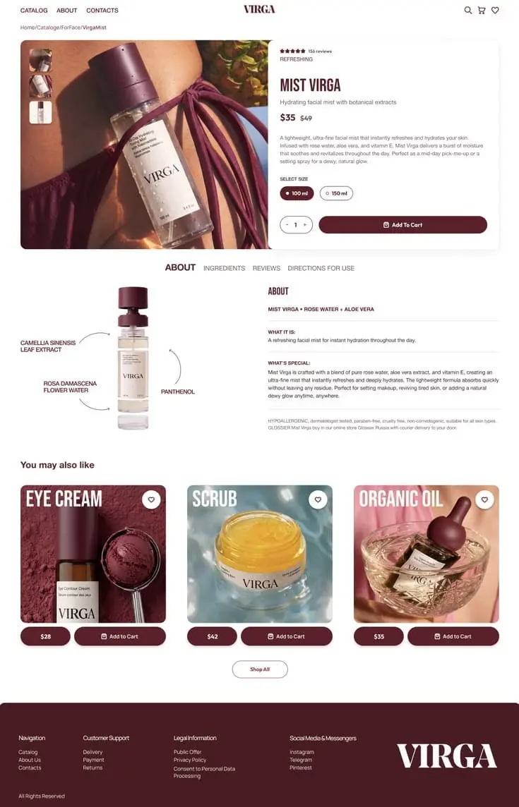
Add these details to the product page and place the most important ones near the price and variant selector. For a facial mist, for example, list the volume of each option, the ingredients and how to use it. Do not make shoppers search reviews, separate articles or customer support for this information.
The full cost appears after the item is added to the cart
If shipping, a mandatory fee or a promotion condition appears only in the cart, the product page shows an incomplete purchase price. Shoppers then have to reconsider after they have already chosen the product.
Show available shipping methods and free-shipping conditions before the add-to-cart button. Keep the price, discount and currency consistent across the product page, cart and checkout. If shipping costs depend on the delivery address, say so before the cart and make clear when shoppers will see the exact amount.
The next step is hard to see on mobile
If the purchase button sits far from the price or disappears after a shopper selects a variant, the page complicates the order at the point when the shopper is ready to act. The selected size or colour can also be easy to miss on a phone.
Test the full mobile flow: select a variant, review the price, add the item to the cart and proceed to checkout. Keep the purchase button accessible near the key product information and show a clear confirmation after it is tapped. In GA4, compare product views, add-to-cart events and purchases by device, traffic source and product. If mobile views are high but add-to-cart activity is low, fix the mobile product page. If shoppers add items to the cart but do not buy, fix shipping costs or the checkout flow.
Do not start by changing the button colour or redesigning the entire site. First fix search relevance, variant data, product details, total cost and the mobile buying flow.